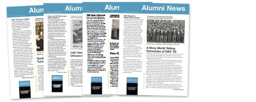
Is your alumni organization’s newsletter underperforming?
I think I know why.
Among my many responsibilities, I manage a talented team of graphic designers and writers. We output over a thousand pieces of marketing collateral each year for our clients, some of which are large Fortune 500 companies. Through the years, I’ve been asked to help organizations improve their marketing collateral, and in most cases it comes down to a battle between content, function and design.
In my consulting role among alumni organizations, I see the same battle, especially when it comes to e-newsletters. So to learn more, I decided to do a simple Google search using the term “alumni newsletter.” Here are the results .http://bit.ly/1Lm8itq
As you can see, many alumni newsletters are designed just like a good old-fashioned newspaper. They have a large banner at the top, the body copy contains several unrelated articles, and it’s laid out in multiple columns. But the most troubling thing is how tons of text is crammed onto a single page (usually the size of an 8.5 x 11 inch piece of paper.)
I call it word vomit.
Here’s an example of an alumni e-newsletter I pulled randomly from the web. I’ve removed any identifying names or locations to protect the innocent.

These types of e-newsletters are forgettable and boring. Is it any wonder why such e-newsletters have little or no impact on engagement?
Newsletters, and eventually e-newsletters, evolved during the heyday of newspapers and magazines. In their day, newsletters were a cost effective way to disseminate a lot of information cheaply. And because it was not cost effective to leave unused print space, they packed as much text as possible onto the page.
But the habits of bygone days die hard among some alumni folks. They’re stuck in golden era of print, believing that an e-newsletter is simply a digitized version of a printed newsletter.
It is not!
An e-newsletter takes advantage of the technology and doesn’t ignore it. It also leverages our decreasing willingness to pay attention for more than a few seconds. Good e-newsletters are interactive, compelling, and brief, …oh, and did I say interactive?
More important, your e-newsletter should be focused outwardly on what your alumni/ae need and want. (Think WIIFT: What’s In It For Them.) Focus on how your alumni can benefit personally from your content.
So to put it bluntly, get over yourself. The inner-workings of your organization are not newsworthy. Frankly, nobody really cares about your newly hired associate director or database assistant. Nor do they care to read “greetings from the board president.” Save it for a blog or a Facebook post. It’s not relevant to most alumni. It’s forgettable and a wasted effort.
Remember, you only have a few seconds to get your alums to buy-in to your e-newsletter, so it must be compelling and easily scannable.
To get the best of your e-newsletter, here are my top ten tips for an effective alumni e-newsletter :
If you want to see an example of a good alumni e-newsletter, look here.
Creating a compelling e-newsletter is an evolution, not a revolution, so be patient. But don’t stop experimenting, practicing, and changing your e-newsletter to make improvements. It’s a matter of strategizing, prioritizing, executing, and analyzing. The shampoo algorithm applies.


